Project Voight: UI Feedback
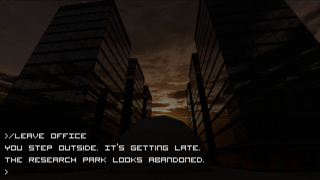
A couple of goons pointed out that it’s really cramped to have the text occupy half the screen. At the same time, it feels like it might be annoying if only two of the rows were visible and you had to scroll all about to read back. Instead, a nice compromise is to have a selectable ratio for the dialogue area. 25%, 50%, 100%. Also, make it semi-transparent so that the art can still be seen.